使用一個文件結構樹 DOM 來表示整個html文件.
物件上可以設計屬性和方法, 通過操作物件上的屬性或方法, 可以間接的操作頁面中的元素.
利用這種方式將html、CSS、JavaScript整合在了一起,形成了現在的Dhtml技術.
Dhtml可以分為兩部分內容: BOM和DOM
document.getElementById(id).style.property=新樣式
例如:
<h1 id="id1">我的標題</h1>
<button type="button" onclick="document.getElementById('id1').style.color='red' ">
點我!</button>
0% 將使圖像全黑。
100% (1) 是預設值,代表原始圖像。
超過 100% 的值將提供更明亮的結果。
img { filter: brightness(200%);}
例:更明亮的圖像
0% 將使圖像全黑。
100% (1) 是預設值,代表原始圖像。
超過 100% 的值將提供對比度更高的結果。
img {
  filter: contrast(200%);
}
例:更明亮的圖像
filter: drop-shadow(h-shadow v-shadow blur spread color)
可能的值:
filter: drop-shadow(8px 8px 10px red);
filter: grayscale(50%);
0% (0) 是預設值,代表原始圖像。
100% 將使圖像完全變灰(用於黑白圖像)。
注意:不允許使用負值。
例:圖像變灰色
0deg 是預設值,代表原始圖像。
注意:最大值為 360 度。
filter: hue-rotate(90%);
例:色調旋轉
0% (0) 是預設值,代表原始圖像。
100% 將使圖像完全倒置。
注意:不允許使用負值。
filter: invert(100%);
例:反轉圖像
0% 是完全透明的。
100% (1) 是預設值,代表原始圖像(無透明度)。
注意:不允許使用負值。
提示:此濾器類似於不透明度屬性。
filter: opacity(30%);
例:不透明度

img:hover {
  opacity: 0.5;
}
當用戶將鼠標懸停在圖像上時圖像透明。 這個 CSS 是 opacity:0.5;。
當鼠標指針離開圖像時,圖像將再次不透明。
0% (0) 將使圖像完全不飽和。
100% 是預設值,代表原始圖像。
超過 100% 的值提供超飽和結果。
注意:不允許使用負值。
filter: saturate(800%);
例:圖像飽和
0% (0) 是預設值,代表原始圖像。
100% 將使圖像完全棕褐色。
注意:不允許使用負值。
filter: sepia(90%);
例:棕褐色圖像
例:各種濾鏡
例子:
filter: url(svg-url#element-id)
div#div2
{
	transform:translate(50px,100px);
}
移動
transform:rotate(30 deg);
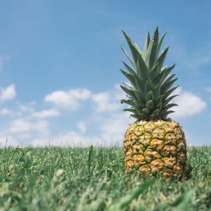
<img style="transform:rotate(30deg);"
  src="../css/filters/pineapple.jpg">
<div style="transform: scale(1.4, 0.7);">
div 元件的寬度是原始大小的1.4倍,
         高度是原始大小的0.7倍。
</div>
scale() 方法也可做圖文翻轉:
<div style="transform: scale(-1);"></div>
      <table>
         <tr>
            <td style = "transform: scaleX(-1);transform: scaleX(-1);">Text</td>"
            <td>Text
         </tr>
         <tr>
            <td style = "transform: scale(-1,-1);">Text</td>
            <td style = "transform: scaleY(-1);">Text</td>
         </tr>
      </table>
Flip
<div style="transform: skew(30deg, 20deg);">
</div>
matrix(scaleX(),scaleY(),skewX(),skewY(),translateX(),translateY())例如
<div style="transform:matrix(0.866,0.5,-0.5,0.866,0,0);">
</div>
matrix
.box3 {
  transform-origin: 120px 130px;
  transition: 2s ease-in-out;
}

.box3:hover {
  transform: rotate(700deg);
}
變形原點(transform-origin)可以用正負數值來代表對原來原點的偏移量(X軸偏移量與Y軸偏移量),或是用top/center/bottom(top = 0%, bottom=100%)、left/center/right(left = 0%, right = 100%)等組合來直接定義新的位置。
.box5:hover {
  transition: 2s ease-in-out;
  transform: rotateX(60deg);
}
一般來說,我們會在要進行3D變形的外層容器元件來定義 perspective,這樣包含在其內的子元件(物件)都可以按照這個深度來進行變形。
perspective: 500px;
另一種是定義在transform中,以類似函式的方式來定義數值:
transform: perspective(250px);
background-image: radial-gradient(shape size at position, start-color, ..., last-color);
<style>
.circle {
  display: block;
  background: black;
  border-radius: 100%;
  height: 300px;
  width: 300px;
  margin: 0;
  background: radial-gradient
        (circle at 100px 100px, #5cabff, #000);
}
</style>
<figure class="circle"></figure>
下例將圖片剪裁為圓形:
<style>
img {
  clip-path: circle(50%);
}
</style>
<img src="../css/filters/pineapple.jpg"
			width="140" height="140">
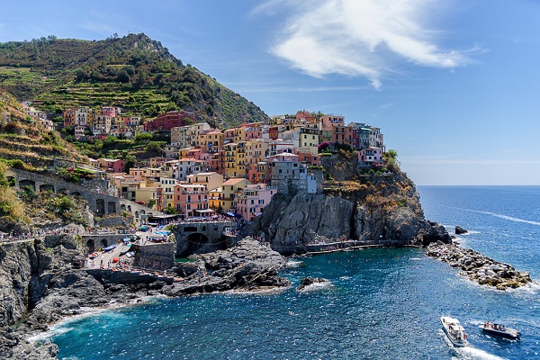
下例將圖片剪裁為橢圓形:
<style>
img {
  clip-path: ellipse(50% 45% at 50% 50%);
}
</style>
<img src="../css/gif/img_5terre.jpg"
			width="150" height="100">
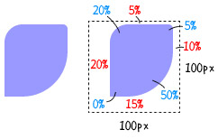
下例內置矩形 inset( 上右下左的邊距 round 上右下左圓角 ):
<style>
 .inset{
    width:100px;
    height:100px;
    background:#99f;
    clip-path:inset(10px 20px 30px 10px
                       round 20px 5px 50px 0);
  }</style>
<img class="inset" src="../css/gif/img_5terre.jpg"
			width="150" height="150">
Clip Path 參考資料