
將鼠標懸停在下面的紅色方塊上,查看轉場效果:
CSS 轉場允許您在給定的持續時間內平滑地更改屬性值。
要創建轉場效果,您必須指定兩件事:
<style>
div {
  width: 100px;
  height: 100px;
  background: red;
  transition: width 2s;
}
當指定的 CSS 屬性(寬度)更改值時,轉場效果將開始。
現在,當用戶將鼠標懸停在 <div> 元件上時,讓我們為 width 屬性指定一個新值:
<style>
div:hover {
  width: 500px;
}
</style>
transition-timing-function 屬性可以具有以下值:
div {
  transition: width 2s, height 2s, transform 2s;
}
以下示例為轉場添加了變形效果, 請將鼠標懸停在紅色方塊:
HTML 結構如下:
<div class="perspective">
  <div class="flip-box">
  </div>
</div>
翻牌的基本CSS 結構如下:
.perspective {
  preserve: 500px;
}
.flip-box {
  transform-style: preserve-3d;
  transform: rotateY(180deg);
}
請將滑鼠懸停在牌上
例題:翻牌
div {
  transition-property: width;
  transition-duration: 2s;
  transition-timing-function: linear;
  transition-delay: 1s;
}
或使用速記屬性轉換:
div {
  transition: width 2s linear 1s;
}
CSS 3D原理參考CSS 3D - 原理篇
下例實現文本的水平滾動,達到走馬燈的效果:
<style>
div.animate {
  animation-name: example;
  animation-duration: 12s;
  animation-timing-function: linear;
  animation-iteration-count: infinite;
}

@keyframes example {
  from {transform:translatex(-100%);}
  to {transform:translatex(100%);}
}
</style>
<div id="animate" style="font-size:3vw">Welcome to CSS animation! Welcome to CSS animation!</div>
下面的示例將“example”動畫綁定到 <div> 元件。 動畫將持續 4 秒,它會逐漸將 <div> 元件的背景顏色從“紅色”更改為“黃色”:
@keyframes 也可以設定幾個影格,如下所示:
@keyframes xmp {
  0% {transform:translate(0,0); }
  50% {transform:translate(200px,200px);}
  75% {transform:translate(200px,0px);}
  100% {transform:translate(0px,0px);}
}
| 屬性 | 說明 |
|---|---|
| animation-name | 動畫名稱 |
| animation-duration | 動畫持續時間,預設 0,單位 s 或 ms。 |
| animation-delay | 動畫延遲播放時間,預設 0,單位 s 或 ms。 |
| animati1on-iteration-count | 動畫播放次數,預設 1。 其他還有 infinite |
| animation-timing-function | 動畫加速度函式,預設 ease。 其他還有: linear、ease-in、ease-out、ease-in-out step-start、step-end、steps(int,start/end)、cubic-bezier(n,n,n,n)。 |
| animation-direction | 動畫播放方向,預設 normal。其他還有 reverse、alternate、alternate-reverse。 |
| animation-fill-mode | 動畫播放前後模式,預設 none。 其他還有 forwards、backwards、both。 |
| animation-play-state | 動畫播放或暫停狀態,預設 running。 其他還有 paused。 |
animation:name duration | timing-function | delay | iteration-count | direction | fill-mode | play-state;
div {
  animation-name: example;
  animation-duration: 5s;
  animation-timing-function: linear;
  animation-delay: 2s;
  animation-iteration-count: infinite;
  animation-direction: alternate;
}
使用速記動畫屬性可以實現與上面相同的動畫效果:
div {
  animation: example 5s linear 2s infinite alternate;
}
.ball {
  width: 100px;
  height: 100px;
  border-radius: 50%;
  background: radial-gradient
      (circle at 50px 50px, #5cabff, #000);

  animation: bounce 0.5s;
  animation-direction: alternate;
  animation-timing-function:
      cubic-bezier(.5,0.05,1,.5);
  animation-iteration-count: infinite;
}

@keyframes bounce {
  from { transform: translate3d(0, 0, 0);     }
  to   { transform: translate3d(0, 300px, 0); }
}
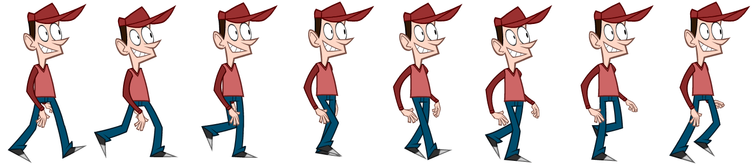
以戴帽人為例,使用以下屬性呈現動畫:
animation: <name> <duration of one frame in seconds> steps(<number of frames>)動畫:<名稱> <一影格的持續時間(以秒為單位)> 步驟(<影格數>)<完成動畫的持續時間>。
先量得精靈圖的大小為 1472x325px,有八個影格,則單一影格大小為 184x325px。
在樣式表中,為 @keyframes 設定取圖範圍 ,即精靈圖寬度 0 到 1472px。
接著在 capguy 類別中,設定單一影格大小、背景圖片(即精靈圖)的 url,以及動畫屬性。
記得要頁面標明呈現動畫的區塊: <div class="capguy"></div>
如下所示:動畫名為walk、單格停留 1 秒、有 8 步(8格)和動畫無限持續。
<style>
@keyframes walk {
    from { background-position: 0px; }
    to { background-position: -1472px; }
}                         /* 精靈圖寬度*/

.capguy {
    width: 184px; height: 325px;  /* 單一影格大小*/
    background-image: url("../css/gif/capguy-walk-1472.png");  /* sprite 圖片位址*/
    margin: 0 auto;   /* 表示上下邊界為0 ,左右為 auto 表示自動均分。*/
    animation: walk 1s steps(8) infinite;  /* 動畫屬性*/
}
</style>
<div class="capguy"></div>
現在將以上代碼放置在希望播放動畫的頁面中就成功了。
例題: 戴帽人立定走
參考資料:animate-sprites-in-css
如要平移,必須在樣式表中加入平移的關鍵影格如下:
@keyframes move_forward	{
	0%{transform:translateX(-736px);}
	100%{transform:translateX(736px);}
	}
並將 move_forward 類別加入 capguy 的 animation 屬性,注意要用逗號隔開如下:
animation: walk 1s steps(8) infinite, move_forward 8s linear infinite;
例題: 戴帽人行走
例題: 熊貓走路
參考資料:panda Animation
有的精靈圖(如騎馬奔駛圖)各影格位置不易計算,可先用sprite-cutter切割為個別影格。
如騎馬奔駛圖切成16片,@keyframes 設定 16 段,每段佔 6.25%。
注意 animation-timing-function 設定為 step-start,動畫開始立即呈現第一個影格。
 <style>
  #horse {
    width:186px;
    height:141px;
    position:absolute;
    animation: oxxo 1s infinite step-start ;
  }

@keyframes oxxo{
    0%{
    background-image:url("tile000.jpg");
    }
    6.25%{
    background-image:url("tile001.jpg");
    }
      ... 依此類推,每格相間 6.25%
    100%{
    background-image:url("tile000.jpg");
    }
}
  </style>
  <div id="horse"></div>
例題: 騎馬奔駛
參考資料:css-animation
賽馬
原圖在:shawnmcburnie
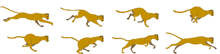
對於這個大小為 450px × 112px 的圖像,精靈幀大小為 112.5px X 112px,我們需要水平移動 4 幀,垂直移動 2 幀。
這意味著我們需要創建兩個單獨的 @keyframe 動畫來遍歷每個方向。 當 X 方向動畫正在播放時,Y 必須凍結直到它完成。
除非 X 動畫完成,否則不得觸發 Y 動畫。 這可以通過我證明 Y 動畫的動畫時間增加 4倍來完成。
     div.leopard{
      width: 112.5px;
      height: 56px;
      margin: 0 auto;
      background-image: url("../css/gif/leopard.png");
      animation: playX 1s steps(4) infinite,
                 playY 4s steps(2) infinite,
                 move_forward 12s linear infinite;
    }
    @keyframes playX {
      from {background-position-x: 0px;}
      to {background-position-x: -450px;}
    }
    @keyframes playY {
      from {background-position-y: 0px;}
      to {background-position-y: -112px;
      }
    @keyframes move_forward	{
		0%{transform:translateX(0px);}
		100%{transform:translateX(450px);}
	 }
    }
例題: Leopard
參考資料:css-animations-using-with-spritesheets-in-a-grid-image
因為位置都使用了絕對位置 ( absolute ),因此我們要將所有的 div 定位在圓心一定有難度,這時候就必須使用 CSS3 的好用工具:calc, calc可以自動計算位置,藉由這個方式,我們直接可以讓 CSS 替我們計算出圓心,相當的方便。( 注意!calc 的 + 、 - 號前後必須有空格,不然會出錯 ), 然後就是每個 animation 要逐一加上延遲時間,就可以逐一地冒出來,如果我們再把半徑設大一點,就會變成圓形或是橢圓形囉!
例題: 水波效果
參考資料:css-water-wave
<!DOCTYPE html>
<html>
<body>

<h1>My First JavaScript Animation</h1>

<div id ="container">
  <div id ="animate">動畫在此進行</div>
</div>

</body>
</html>
#container {
  width: 400px;
  height: 400px;
  position: relative;
  background: yellow;
}
#animate {
  width: 50px;
  height: 50px;
  position: absolute;
  background: red;
}
id = setInterval(frame, 5);

function frame() {
  if (/* test for finished */) {
    clearInterval(id);
  } else {
    /* code to change the element style */
  }
}
例如:
function myMove() {
  let id = null;
  const elem = document.getElementById("animate");
  let pos = 0;
  clearInterval(id);
  id = setInterval(frame, 5);
  function frame() {
    if (pos == 350) {
      clearInterval(id);
    } else {
      pos++;
      elem.style.top = pos + "px";
      elem.style.left = pos + "px";
    }
  }
}
看圖來分析下,我們需要實現哪些效果。
逐步詳細解說見canvas 實現漂亮的下雨效果