<p>This text does not have any style applied to it.</p>

<p style="color:sienna;margin-left:20px">This is a paragraph.</p>

<p style = "font-size: 20pt">This text has the
<em>font-size</em> style applied to it, making it 20pt.
</p>

<p style = "font-size: 20pt; color: blue">
This text has the <em>font-size</em> and
<em>color</em> styles applied to it, making it
20pt. and blue.</p>
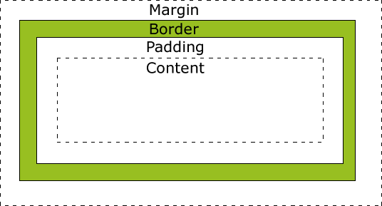
定位之外,元件也可以有實際的尺寸,如 div 區塊的底部邊距有.5em。1em為預設字型的尺寸。
其他可用的單位有 in (英吋)、 cm (公分)、 mm (毫米)、
pt (points, 1pt=1/72 in)、pc (picas, 1pc=12pt)。
在第一個 div 區塊的內聯樣式規定該區塊寬度為屏幕的20%。
假如文字太長,超出範圍,稱為溢出(overflow)。在第三個 div 區塊規定 overflow: scroll,在文字溢出時可以捲動。
<html>
   <head>
      <style type = "text/css">
         div { background-color: #ffccff;
               margin-bottom: .5em }
      </style>
   <head>
   <body>

      <div style = "width: 20%">Here is some
      text that goes in a box which is
      set to stretch across twenty precent
      of the width of the screen.</div>

      <div style = "width: 80%; text-align: center">
      Here is some CENTERED text that goes in a box
      which is set to stretch across eighty precent of
      the width of the screen.</div>

      <div style = "width: 20%; height: 30%; overflow: scroll">
      This box is only twenty percent of
      the width and thirty percent of the height.
      What do we do if it overflows? Set the
      overflow property to scroll!
      </div>

   </body>
</html>
通常瀏覽器依照文本和元件在 html 文件中出現的次序顯示在屏冪上。
區塊使用屬性 float 可以浮動。下例中第二和第三個 div 區塊靠右移動。顯示時第二個 div 區塊在第三段文本的右側。
使用屬性 text-align 可使文本在區塊中靠左、靠右或居中對齊。如第一個區塊文本居中,第二、三區塊文本靠右。
<html>
   <head>
      <title>Flowing Text Around Floating Elements</title>

      <style type = "text/css">

         div { background-color: #ffccff;
               margin-bottom: .5em;
               font-size: 1.5em;
               width: 50% }

         p   { text-align: justify; }

      </style>

   </head>

   <body>

      <div style = "text-align: center">">
         Deitel & Associates, Inc.</div>

      <div style = "float: right; margin: .5em;
         text-align: right">
         Corporate Training and Publishing</div>

      <p>Deitel & Associates, Inc. is an internationally
      recognized corporate training and publishing organization
      specializing in programming languages, Internet/World
      Wide Web technology and object technology education.
      Deitel & Associates, Inc. is a member of the World Wide
      Web Consortium. The company provides courses on Java,
      C++, Visual Basic, C, Internet and World Wide Web
      programming, and Object Technology.</p>

      <div style = "float: right; padding: .5em;
         text-align: right">
         Leading-edge Programming Textbooks</div>

      <p>The company's clients include many Fortune 1000
      companies, government agencies, branches of the military
      and business organizations. Through its publishing
      partnership with Prentice Hall, Deitel & Associates,
      Inc. publishes leading-edge programming textbooks,
      professional books, interactive CD-ROM-based multimedia
      Cyber Classrooms, satellite courses and World Wide Web
      courses.<span style = "clear: right"> Here is some
      unflowing text. Here is some unflowing text.</span></p>

   </body>
</html>
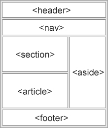
整頁包在區塊 container 中,內含四個方塊: 標題 header、頁腳 rooter、左框 left 和內容 content。
左框 left 向左浮動。頁腳標明 clear:left,不受左框影響。
<html>
   <head>
      <title>使用 float 的網頁佈局</title>
      <style type = "text/css">
div.container
{
	width:100%;
	margin:0px;
	border:1px solid gray;
	line-height:150%;
}
div.header,div.footer
{
	padding:0.5em;
	color:white;
	background-color:gray;
	clear:left;
}
h1.header
{
	padding:0;
	margin:0;
}
div.left
{
	float:left;
	width:160px;
	margin:0;
	padding:1em;
}
div.content
{
	margin-left:190px;
	border-left:1px solid gray;
	padding:1em;
}
      </style>
   </head>

   <body>

<div class="container">
<div class="header"><h1 class="header">w3big.com</h1></div>
<div class="left"><p>"Never increase, beyond what is necessary, the number of entities required to explain anything." William of Ockham (1285-1349)</p></div>
<div class="content">
<h2>Free Web Building Tutorials</h2>
<p>At w3cschool you will find all the Web-building tutorials you need,
from basic HTML and XHTML to advanced XML, XSL, Multimedia and WAP.</p>
<p>w3cschool - The Largest Web Developers Site On The Net!</p></div>
<div class="footer">Copyright 1999-2005 by Refsnes Data.</div>
</div>

   </body>
</html>
<html>
   <head>
      <title>Borders</title>

      <style type = "text/css">

         body    { background-color: #ccffcc }

         div     { text-align: center;
                   margin-bottom: 1em;
                   padding: .5em }

         .thick  { border-width: thick }

         .medium { border-width: medium }

         .thin   { border-width: thin }

         .groove { border-style: groove }

         .inset  { border-style: inset }

         .outset { border-style: outset }

         .red    { border-color: red }

         .blue   { border-color: blue }

      </style>
   </head>

   <body>

      <div class = "thick groove">This text has a border</div>
      <div class = "medium groove">This text has a border</div>
      <div class = "thin groove">This text has a border</div>

      <p class = "thin red inset">A thin red line...</p>
      <p class = "medium blue outset">
         And a thicker blue line</p>

   </body>
</html>